Intro
I’m creating some open source angular components to use across multiple projects within the organization. This might be useful for other people as well. The components will be open source and reside in a Github repo and will be packaged into an npm package.
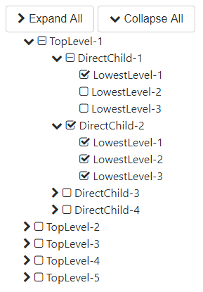
The first component in this library will be a Treeview. At the core this is a pretty easy component to build, but further on I will tell you about a small bump on the road and the design decision that was made to bypass that bump.
Let’s get to it.
Treeview
I needed a treeview for a project with the following requirements:
- Recursive
- Tri-state select visualization
- Retrieve selected items on a level per level basis

spikes-treeview
In theory, we could do without a main component for a simple treeview. But if you would like to show Collapse/Expand All buttons, they would need to live outside of the treeview items.
Later, other functionalities can be added like e.g. search.
But I digress. This is the main tree-view component:
html
<div class="row"><div *ngIf="treeviewConfiguration.showToggleAll" class="col-lg-12"><button type="button" class="btn btn-secondary" (click)="toggleAll(true)"><i [ngClass]="[treeviewConfiguration.mainFont, treeviewConfiguration.expandIcon]"></i> Expand All</button><button type="button" class="btn btn-secondary" (click)="toggleAll(false)"><i [ngClass]="[treeviewConfiguration.mainFont, treeviewConfiguration.collapseIcon]"></i> Collapse All</button></div><spikes-treeview-item [treeviewItems]="treeviewItems" [treeviewConfiguration]="treeviewConfiguration"></spikes-treeview-item></div>
The main component exists out of 2 parts:
- Toggle All buttons:
Through configuration there can be decided to show the Expand All/Collapse All The default setting is false. - Spikes-treeview-item:
Explained below.
ts
@Component({ selector: 'spikes-treeview', templateUrl: './spikes-treeview.component.html', styleUrls: ['./spikes-treeview.component.css']})export class SpikesTreeviewComponent implements OnInit { private _treeviewConfiguration: models.ITreeviewConfiguration; private _treeviewItems: Array<models.TreeviewItem> = [];@Input() set treeviewConfiguration(config: models.ITreeviewConfiguration){this._treeviewConfiguration = new models.TreeviewConfiguration();Object.assign(this._treeviewConfiguration, models.TreeviewConfiguration.defaultTreeviewConfiguration, config); } get treeviewConfiguration(){if (this._treeviewConfiguration == null){ this._treeviewConfiguration = new models.TreeviewConfiguration(); Object.assign(this._treeviewConfiguration, models.TreeviewConfiguration.defaultTreeviewConfiguration);}return this._treeviewConfiguration; } @Input() set treeviewItems(items: Array<models.TreeviewItem>) {this._treeviewItems = [...items]; }; get treeviewItems() {return this._treeviewItems; } constructor() { } ngOnInit() { }}The main component takes 2 inputs:
- treeviewConfiguration: configuration of the treeview (url github)
- treeviewItems: items to show
spikes-treeview-item
The treeview item is the recursive component of the treeview. It has a reference to itself as you can see in the html below.
html
<div class="row"><div class="col-lg-12"><ul><li class="spikes-treeview-item" *ngFor="let item of treeviewItems"><span *ngIf="item.childItems != null && item.childItems.length > 0"><a (click)="item.toggle()"><i [ngClass]="[treeviewConfiguration.mainFont, !item.expanded ? treeviewConfiguration.expandIcon : treeviewConfiguration.collapseIcon]"></i></a></span><span *ngIf="treeviewConfiguration.showSelection"><a (click)="item.setState(item.itemState, item.itemState === 3 ? 1 : 3)"><i [ngClass]="[treeviewConfiguration.mainFont, item.itemState === 1 ? treeviewConfiguration.checkedIcon : item.itemState === 3 ? treeviewConfiguration.uncheckedIcon : treeviewConfiguration.indeterminateIcon]"></i></a></span><span (click)="item.setState(item.itemState, item.itemState === 3 ? 1 : 3)">{{ item.displayText }}</span><div *ngIf="item.expanded"><spikes-treeview-item [treeviewItems]="item.childItems" [treeviewConfiguration]="treeviewConfiguration"></spikes-treeview-item></div></li></ul></div></div>So what’s going on here:
<li class="spikes-treeview-item" *ngFor="let item of treeviewItems">
We loop through all the items passed to the spikes-treeview-item component.
<span *ngIf="item.childItems != null && item.childItems.length > 0">
wrapper for the expand/collapse icon for each item.
Hidden when the current treeview-item does not have any child items.
<a (click)="item.toggle()">
open or close the underlying child-items
<i [ngClass]="[treeviewConfiguration.mainFont, !item.expanded ? treeviewConfiguration.expandIcon : treeviewConfiguration.collapseIcon]">
an icon that is styled through css classes.
Default: font-awesome
<span *ngIf="treeviewConfiguration.showSelection">
wrapper for the checkbox icon for each item.
Through configuration we can indicate if we want to show checkboxes. The default is true.
<a (click)="item.setState(item.itemState, item.itemState === 3 ? 1 : 3)">
select or unselect the treeview-item.
Selecting (or unselecting) has an effect on the underlying child-items as well as on the parent items above. (Recursively)
<i [ngClass]="[treeviewConfiguration.mainFont, item.itemState === 1 ? treeviewConfiguration.checkedIcon : item.itemState === 3 ? treeviewConfiguration.uncheckedIcon : treeviewConfiguration.indeterminateIcon]">
an icon that is styled through css classes.
Default: font-awesome
<span (click)="item.setState(item.itemState, item.itemState === 3 ? 1 : 3)">
shows the displaytext of the treeview-item.
Has the same click response as the checkbox icon.
<div *ngIf="item.expanded">
when the current item has child-items and is expanded, the contents of this div are shown.
<spikes-treeview-item [treeviewItems]="item.childItems" [treeviewConfiguration]="treeviewConfiguration">
the child items of the current treeview-item.
ts
@Component({ selector: 'spikes-treeview-item', templateUrl: './spikes-treeview-item.component.html', styleUrls: ['./spikes-treeview-item.component.css']})export class SpikesTreeviewItemComponent implements OnInit { private _treeviewConfiguration: models.ITreeviewConfiguration; private _treeviewItems: Array<models.TreeviewItem> = []; @Input() set treeviewConfiguration(config: models.ITreeviewConfiguration){this._treeviewConfiguration = new models.TreeviewConfiguration();Object.assign(this._treeviewConfiguration, models.TreeviewConfiguration.defaultTreeviewConfiguration, config); } get treeviewConfiguration(){if (this._treeviewConfiguration == null){ this._treeviewConfiguration = new models.TreeviewConfiguration(); Object.assign(this._treeviewConfiguration, models.TreeviewConfiguration.defaultTreeviewConfiguration);}return this._treeviewConfiguration; } @Input() set treeviewItems(items: Array<models.TreeviewItem>) {this._treeviewItems = [...items];this.normalizeTreeviewItemParents(); }; get treeviewItems() {return this._treeviewItems; } constructor() { } ngOnInit() { }}The item component takes the same 2 inputs:
- treeviewConfiguration: configuration of the treeview (url github)
- treeviewItems: items to show
You might notice that I’m not using an input tag for the checkbox. I tried using it at first, but then I hit a snag.
Tri-state checkbox
There is this property on a checkbox input called “indeterminate”, it cannot be set through HTML, only through script and can be used to indicate that a checkbox is in an “indeterminate” state. You see this kind of thing often when you have a treeview with checkboxes where a parent is “indeterminate” when one or more of its child items, but not all of them, are checked.
At first, I wanted to make use of this property on the checkbox, but I soon found out that browsers handle a click on an indeterminate checkbox differently. This is the small bump that I referred to earlier.
Chrome :

Edge :

As you can see, in the gifs above, a checkbox that is checked and set to indeterminate gets either unchecked (Chrome) or checked (Edge) after clicking it.
Because of this, I changed this to using i-tag and setting an appropriate class to it. I used font-awesome as a default font set for setting the icons. But I left the option to replace them through configuration.
Get selected items
I added a helper class that lets you retrieve the selected items from the treeview:
getTreeviewSelectedItems(treeviewItems)
- Input:
the treeviewItems of the treeview - Output:
a flat list of all selected items, without any information about the level on which the item resides.
getTreeviewSelectedItemsPerLevel(treeviewItems)
- Input:
the treeviewItems of the treeview - Output:
a list of TreeviewLevel Each level has an array of selected items. The level is a number indicator starting from level 1.
Full code and demo app
The code for this component is available on Github under src/components/spikes-treeview.
A demo app showing this component is also available.
Feel free to comment below!


